The Benchmark That Lied to Your Engineering Team
Here’s a scenario that plays out in Slack threads across half the startups in San Francisco. A model tops the MMLU leaderboard, someone drops the announcement link in #engineering with a rocket emoji, and a week later you’ve swapped it into production. Then the support tickets start. Responses feel slower. Your p99 latency chart looks like a heart attack. The “smarter” model is somehow making your users angrier, and nobody can explain why the leaderboard champion is losing in the real world.
The uncomfortable truth is that the benchmark scores everyone obsesses over — MMLU, HellaSwag, GPQA, the whole alphabet soup — were never designed to predict how a model behaves inside a live application serving real traffic. They measure something closer to “how well does this model answer a standardized multiple-choice exam,” which is about as predictive of production performance as someone’s SAT score is of how they’ll handle a chaotic Tuesday at a startup.
This isn’t a fringe complaint anymore. By 2026, the gap between synthetic benchmark rankings and real-world deployment metrics has become one of the most talked-about problems among ML engineers on Hacker News and in MLOps circles. So let’s actually dig into where the two diverge, why it happens, and which numbers you should be staring at instead. I’ve covered the measurement side before in AI Model Performance Metrics Explained 2026, but here the focus is sharper: synthetic scores versus what your monitoring dashboard actually shows.
Synthetic Benchmarks vs Production Metrics: The Quick Comparison
Before we go deep, here’s the honest side-by-side. This table contrasts what published benchmarks measure against what engineers running production systems actually track. The point isn’t that benchmarks are useless — it’s that they answer a different question than the one you’re paying your cloud bill to answer.
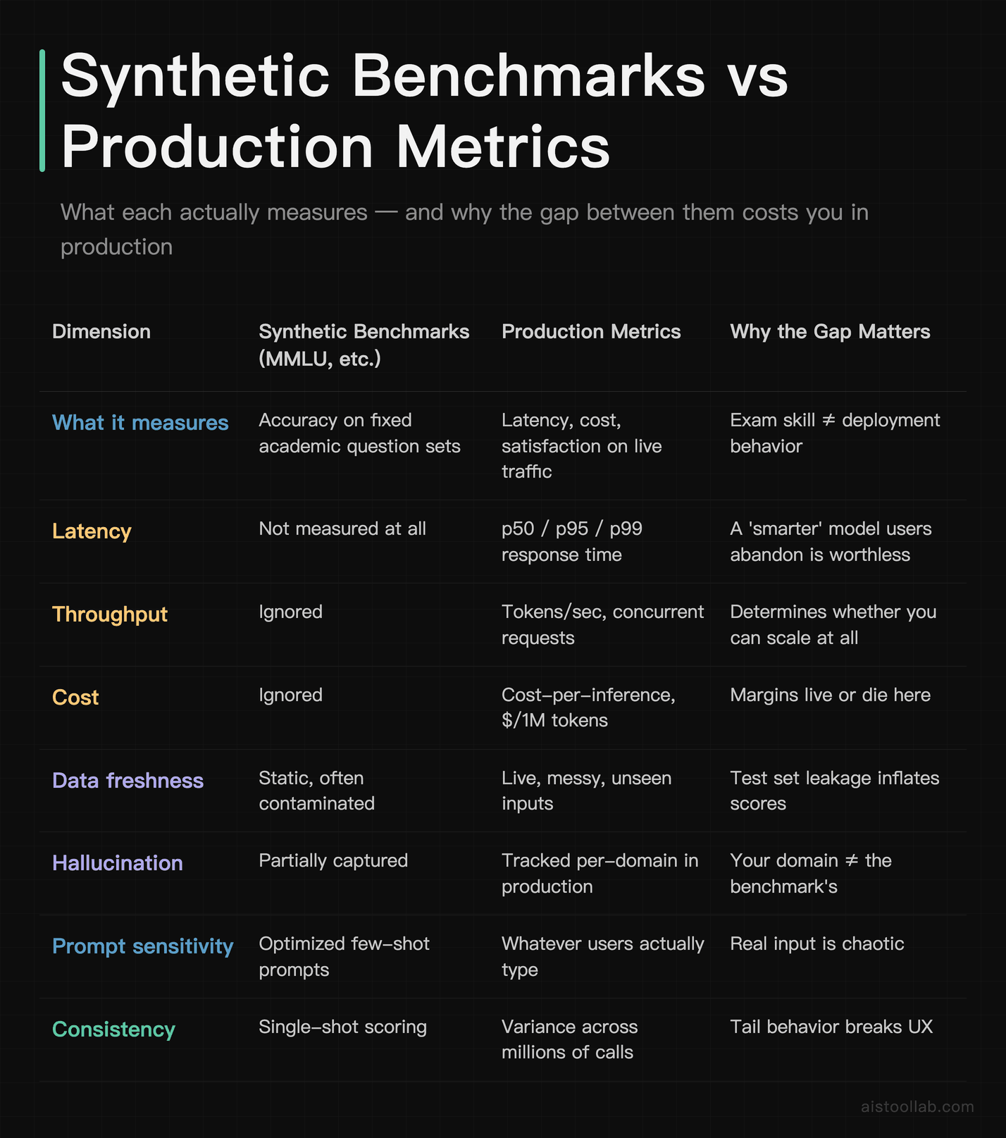
If you take one thing from this table: benchmarks live in column two, your business lives in column three, and almost nobody validates that a high score in one produces a good result in the other. That validation step is where most teams quietly lose money.
Why MMLU Rankings Stopped Predicting Anything Useful
MMLU — the Massive Multitask Language Understanding benchmark — became the de facto bragging metric because it’s broad and easy to cite. It covers dozens of subjects from law to microbiology, and a single percentage makes for a clean headline. But several structural problems mean a higher MMLU score tells you surprisingly little about production fitness.
The first is saturation. The top frontier models from Anthropic, OpenAI, and Google now cluster within a narrow band at the top of MMLU. When several models all score in the same high range, the differences are within the noise of how the test was administered — prompt formatting, answer parsing, few-shot examples. Reviewer consensus across the MLOps community is that once models saturate a benchmark, ranking order becomes nearly meaningless for decision-making. You’re comparing rounding errors.
The second is contamination. Because these benchmarks are public, their questions leak into training data scraped from the web. A model may have effectively “seen the answers” during training, which inflates the score without reflecting genuine reasoning. Researchers have repeatedly flagged this; the issue is widely acknowledged in published evaluation literature, even if the exact magnitude per model is hard to pin down. The practical effect is that benchmark gains don’t always translate to gains on the genuinely novel inputs your users send.
The third — and the one engineers feel most — is that MMLU measures zero of the things that determine whether a deployment succeeds. It says nothing about how fast the model responds, how much each call costs, how it behaves on a 30,000-token context window, or how often it confidently invents a fact in your specific domain. A model can be a benchmark monster and a production liability at the same time. I went deeper on the mechanics of these tests in AI Model Performance Metrics Explained 2026, but the headline is simple: the leaderboard optimizes for the wrong target.
Claude, GPT-4, and Gemini: Benchmark Glory vs Deployment Reality
Let’s make this concrete with the three model families most Western teams actually choose between. I want to be careful here — exact benchmark numbers shift with every release, and I’m not going to quote precise percentages I can’t currently verify against official model cards. Instead, here’s the pattern that holds across published documentation and the consensus in public reviews.
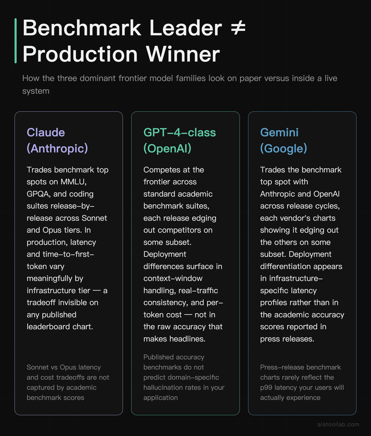
The benchmark picture
On the standard academic suite — MMLU, GPQA, math and coding benchmarks — Claude (Anthropic’s Sonnet and Opus tiers), GPT-4-class models from OpenAI, and Google’s Gemini family trade the top spot release by release. Each new version ships with a chart showing it edging out the others on some subset. According to each vendor’s own published benchmarks, they’re all excellent and all roughly comparable at the frontier. If you picked purely on these charts, you’d basically flip a coin.
The deployment picture
This is where they actually separate, and it has little to do with the leaderboard. Based on official documentation and widely reported user experiences:
- Latency and time-to-first-token differ meaningfully between models and between the same model on different infrastructure. A model with a marginally lower MMLU score but noticeably faster first-token response often wins for chat UX, because perceived speed drives satisfaction more than a few accuracy points.
- Cost-per-inference varies widely across tiers. The flagship “smartest” model is frequently several times more expensive than a mid-tier sibling that’s more than good enough for the task. Teams that route every request to the top model purely because it tops a chart are often setting fire to their margins.
- Context behavior is uneven. All three families advertise large context windows, but public reviews consistently report that effective use of long context — actually reasoning over the middle of a huge document rather than just the ends — degrades differently per model. The benchmark number for “context length” is a capacity, not a quality guarantee.
- Domain hallucination is the wildcard. A model that’s reliable on general knowledge may fabricate confidently in your niche — legal citations, internal API names, medical dosing. None of the headline benchmarks capture your domain, so you only discover this in production.
The takeaway: the “best model” question is almost meaningless without your workload attached. For a high-volume classification pipeline, the right answer might be a cheaper, faster model that benchmarks lower. For a complex agentic coding task, paying for the frontier tier pays off. The leaderboard can’t make that call for you. If you want the model-specific deep dives, I’ve broken these down in my Claude 3.5 Sonnet Performance Review 2026 and the Google Gemini 2.0 Review 2026.
Why Inference Speed Beats Benchmark Scores in Production
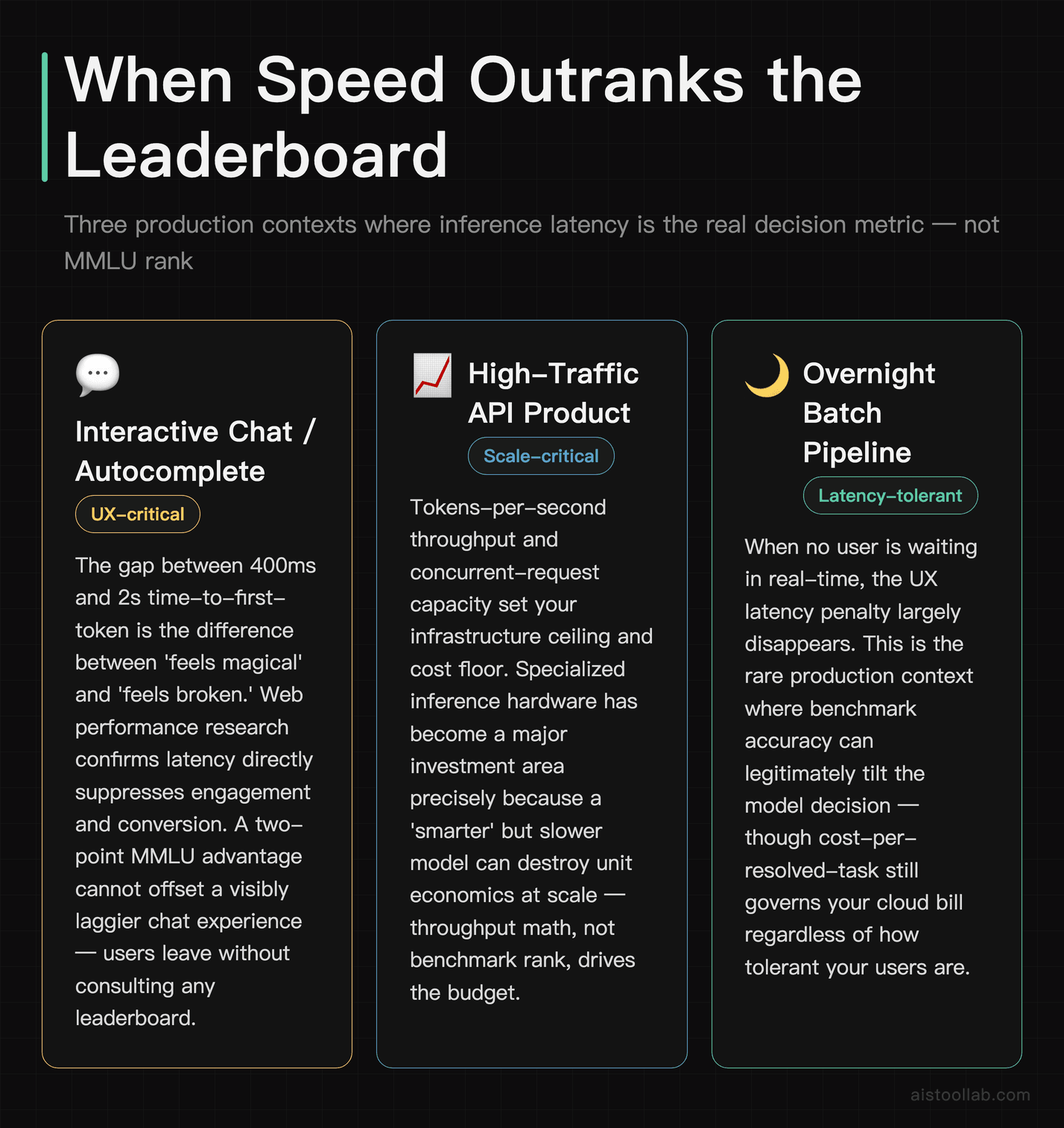
Ask any engineer who’s shipped an LLM feature what keeps them up at night, and “our MMLU score” will not be on the list. “Our p99 latency spiked during the Tuesday traffic peak” absolutely will be. Here’s why speed and throughput dominate the production conversation in a way no accuracy benchmark does.
Users have a brutally short patience window. In interactive applications — chat, autocomplete, search — the difference between a 400ms first token and a 2-second first token is the difference between something that feels magical and something that feels broken. There’s a well-established body of web performance research showing that latency directly suppresses engagement and conversion; that relationship doesn’t disappear just because there’s an LLM behind the request. A model that’s two points “smarter” on a benchmark but visibly laggier will lose to the faster model in real user-satisfaction metrics nearly every time.
Then there’s throughput, which determines whether you can even serve your traffic. Tokens-per-second and concurrent-request capacity decide your infrastructure cost and your ceiling for scale. This is exactly why specialized inference hardware has become such a big story — purpose-built inference platforms market themselves almost entirely on speed and throughput, not on accuracy benchmarks, because that’s what production teams are starving for. I dug into one example in my Groq AI Inference Platform Review 2026, where the entire pitch is latency, not leaderboard rank.
The deeper point is architectural. Benchmarks treat the model as the whole system. Production treats the model as one component inside a pipeline that also includes retrieval, caching, prompt construction, output validation, and fallbacks. A well-engineered system around a “lesser” model routinely outperforms a naive deployment of a “better” one. Your benchmark score never sees any of that surrounding machinery, which is where most of the real wins actually live.
The Metrics Engineers Actually Track
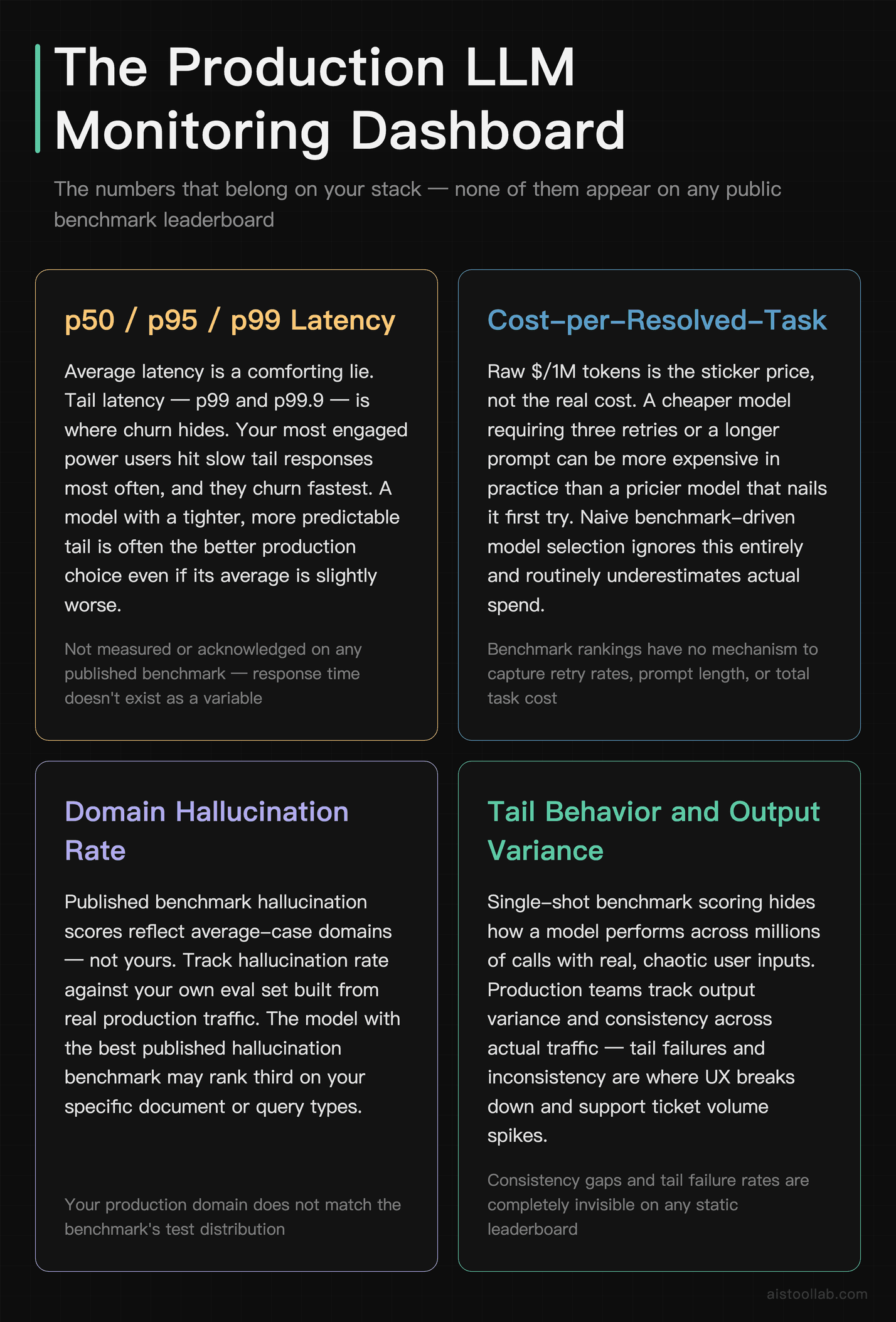
If you’re building or evaluating an LLM system in 2026, here are the numbers that belong on your dashboard. None of them appear on a public leaderboard, and all of them matter more for your bottom line than the model’s MMLU rank.
p50, p95, and p99 latency
Average latency is a comforting lie. Your average might look great while 1% of requests take eight seconds — and that 1% includes some of your most engaged power users hammering the API. p99 (the latency below which 99% of requests fall) and even p99.9 are what reveal tail behavior. Production teams obsess over the tail because that’s where churn hides. A model with a slightly worse average but a tighter, more predictable tail is often the better production choice. Benchmarks measure none of this; they don’t even acknowledge that response time exists as a variable.
Cost-per-inference and cost-per-resolved-task
Raw $/1M tokens is the sticker price, but the metric that actually matters is cost per successfully completed task. A cheaper model that needs three retries or a longer prompt to get the job done can be more expensive in practice than a pricier model that nails it first try. This is where naive benchmark-driven model selection burns budgets: teams pick the top-of-chart model, route everything to it, and watch their inference bill balloon for tasks a mid-tier model would have handled at a fraction of the cost.
Hallucination rate, measured in your domain
General hallucination benchmarks exist, but they don’t predict your domain-specific failure rate. The teams that do this well maintain a curated evaluation set drawn from their own real traffic and edge cases, and they track how often each candidate model fabricates against that set. This is the single highest-leverage evaluation practice I see separating serious teams from leaderboard tourists. Your eval set is proprietary, uncontaminated, and actually representative — three things no public benchmark can offer.
Consistency and variance
Run the same prompt a thousand times. How much does the output vary in quality, format, and length? High variance is a UX and reliability nightmare, especially for structured output feeding downstream systems. A model that’s slightly less peak-capable but far more consistent is usually the better production citizen. Single-shot benchmark scoring completely hides this dimension.
Three Teams, Three Very Different “Best” Models
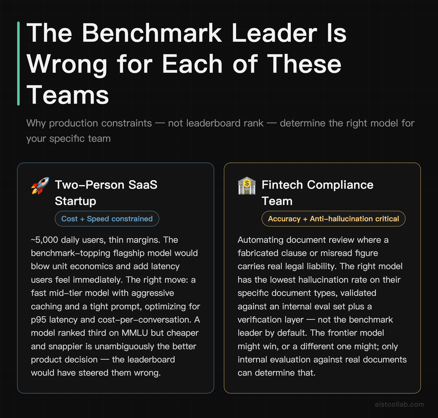
The abstract argument lands harder with concrete scenarios. Here are three realistic Western teams and why the benchmark leader is the wrong default for each.
1. A two-person SaaS startup adding an AI chat assistant
This team has maybe 5,000 daily users and a thin margin. Their dominant constraints are cost and perceived speed, not frontier reasoning. The benchmark-topping flagship model would blow their unit economics and add latency their users would feel instantly. The right move is a fast, mid-tier model with aggressive caching and a tight prompt — optimizing for p95 latency and cost-per-conversation. For them, a model ranked third on MMLU but cheaper and snappier is unambiguously the better product decision. The leaderboard would have steered them wrong.
2. A fintech compliance team automating document review
Here accuracy and hallucination genuinely matter — a fabricated clause or misread figure has real liability. But even this team shouldn’t default to the benchmark leader. What they need is the model with the lowest hallucination rate on their specific document types, validated against an internal eval set, plus a verification layer. The frontier model might win, or a different model with stronger grounding behavior might. The only way to know is to test on their data, because no public benchmark contains their compliance documents. Throughput matters less; correctness in-domain matters enormously.
3. A developer-tools company shipping an AI coding assistant
Coding assistants live and die on time-to-first-token and the quality of long-context understanding across a real codebase. This team should weight latency and effective context handling heavily, then validate code correctness on their own repository samples — not on a public coding benchmark that the model may have partly memorized. For agentic, multi-step tasks they may justifiably pay for the frontier tier, but for inline autocomplete a faster, cheaper model wins. The decision is workload-specific, and the benchmark chart is nearly irrelevant to it.
Notice the pattern: three teams, three different optimal models, and in none of the three cases does “whoever tops MMLU this month” produce the right answer. That’s the whole argument in miniature. If you want a structured way to run these comparisons, my How to Evaluate AI Model Performance Like a Pro piece walks through building an evaluation harness against your own data.
Frequently Asked Questions
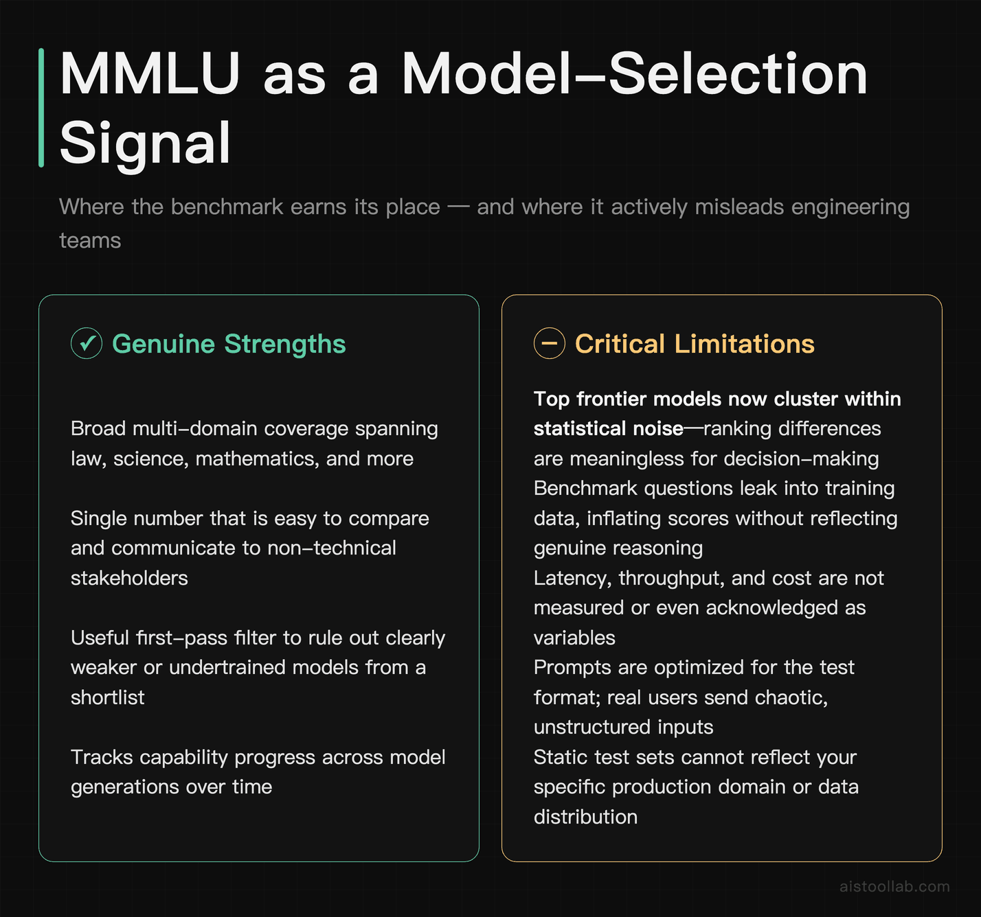
Are AI benchmarks like MMLU completely useless then?
No, and it’s worth being precise here because the contrarian take gets oversimplified. Benchmarks are genuinely useful for a few things: a fast first-pass filter to rule out clearly weaker models, tracking capability progress across model generations, and giving researchers a common yardstick. The problem isn’t that they measure nothing — it’s that people treat a narrow academic measurement as a universal proxy for production fitness, which it was never designed to be. Think of MMLU like a candidate’s degree on a résumé: useful context, a reasonable filter, but you’d never hire someone for an engineering role based on their GPA alone without an interview and a work sample. The right mental model is to use public benchmarks to build a shortlist, then make the actual decision using your own evaluation set, latency measurements, and cost analysis. Benchmarks set the table; your production metrics serve the meal. Teams that conflate the two are the ones who end up surprised when the leaderboard champion underperforms in their app.
What’s the difference between p95 and p99 latency, and which should I track?
Both are percentile measures of response time, and you should track both. p95 means 95% of your requests complete faster than this value — it captures the experience of the bulk of your users. p99 means 99% complete faster, which exposes the slow tail: the worst 1% of requests. That tail matters more than it sounds, because heavy users generate disproportionately many requests, so the slow tail tends to hit your most valuable customers repeatedly. If your average latency is 600ms but your p99 is 5 seconds, a meaningful slice of your traffic is having a genuinely bad time even though the average looks healthy. Most serious production teams monitor p50 (the median, your typical experience), p95, and p99 together to get a full picture, and some go to p99.9 for high-scale systems. The key insight is that latency isn’t one number — it’s a distribution, and the shape of that distribution determines real user satisfaction far more than the mean does. No public model benchmark reports any of this.
Why do models that top the leaderboard sometimes feel worse in real apps?
Several reasons stack up. Latency is the most common culprit — a more capable model is sometimes slower, and users feel speed before they appreciate marginal accuracy gains. Prompt sensitivity is another: benchmarks use carefully optimized prompts, while real users type messy, ambiguous, half-finished requests, and models differ in how gracefully they handle that chaos. Domain mismatch is a big one too — the model aces general-knowledge benchmarks but fabricates in your specific niche, which the benchmark never tested. There’s also the surrounding system: a leaderboard tests the raw model, but your app wraps it in retrieval, caching, and validation, and a “lesser” model in a well-built pipeline beats a “better” model dropped in naively. Finally, consistency — a model with a high peak score but high variance produces unreliable output that frustrates users even when its best responses are excellent. The leaderboard captures peak single-shot capability under ideal conditions; your users experience average behavior under messy conditions. Those two things diverge constantly.
How do I build my own evaluation set instead of relying on benchmarks?
Start by collecting real examples from your actual use case — past user queries, support tickets, documents, whatever your system processes. Aim for a few hundred examples that span the common cases plus the nasty edge cases where models are likely to fail. For each, define what a good output looks like: a correct answer, an acceptable format, an absence of hallucination. Then run every candidate model against this set and score the results, ideally with a mix of automated checks (does it match expected format, does it cite the right source) and human review for quality and factual accuracy. The crucial advantage is that your set is private, so it can’t be contaminated by training data the way public benchmarks are, and it reflects your real distribution of inputs rather than an academic one. Re-run it whenever you consider a model switch or a prompt change. This is more work than reading a leaderboard, but it’s the single practice that most reliably predicts production success. The Hugging Face Model Hub Tutorial 2026 covers some tooling that helps automate parts of this.
Is a faster model always better for production?
Not always — it depends entirely on your workload, which is the whole theme here. For interactive, user-facing features like chat or autocomplete, speed is often the dominant factor because users feel latency immediately and abandon slow experiences. But for asynchronous or batch workloads — overnight document processing, report generation, offline analysis — a few seconds of extra latency is irrelevant, and you should optimize for accuracy or cost instead. There’s also a correctness floor: a blazing-fast model that gets the answer wrong is useless no matter how quick it is, especially in high-stakes domains like finance or healthcare. The right framing is that speed is one weighted input into a decision, and the weight depends on whether a human is waiting for the response in real time. High weight for interactive features, low weight for background jobs. The mistake is treating any single metric — speed, accuracy, or cost — as universally most important. Production model selection is always a workload-specific optimization across all three, plus reliability. There’s no metric that wins in every context, which is exactly why a single leaderboard ranking can’t make the decision for you.
How much does cost-per-inference actually vary between models?
It varies a lot — frequently by several multiples between a vendor’s flagship tier and its mid-tier model, and that’s before you factor in token efficiency. I want to avoid quoting specific per-token prices because they change with every pricing update, but the structural pattern from published pricing pages is consistent: the “smartest” frontier model is substantially more expensive per token than the cheaper siblings in the same family. The deeper subtlety is that headline token price isn’t the real cost. What matters is cost per completed task, which depends on how many tokens the model needs, how often it requires retries, and how long a prompt it needs to perform well. A cheaper model that needs a longer prompt and occasional retries can end up costing more than a pricier, more efficient one. The practical advice: instrument your actual cost-per-resolved-task in production rather than comparing sticker prices, and route different request types to different model tiers rather than sending everything to the most expensive option. This kind of routing is one of the highest-ROI optimizations available, and it’s invisible to anyone looking only at benchmarks.
Do benchmark scores matter at all when choosing between Claude, GPT-4, and Gemini?
They matter as a coarse sanity check, not as a tiebreaker. Since the frontier models from Anthropic, OpenAI, and Google all cluster near the top of the standard benchmarks, the ranking order between them is usually within noise and shouldn’t drive your decision. What should drive it: how each performs on your own evaluation set, their latency and throughput characteristics on your traffic patterns, their pricing relative to your volume, and softer factors like API reliability, rate limits, data-handling and privacy terms, and ecosystem fit with your stack. Many teams also weigh things benchmarks never touch — like which provider’s content policies align with their use case, or which has the better function-calling and structured-output support. The honest reality is that for most applications, all three frontier families are capable enough that the benchmark differences are irrelevant, and the decision comes down to cost, speed, reliability, and how well each handles your specific domain. Test the top two or three on your real workload for a week and let your own metrics decide. The leaderboard is a starting point, not a verdict.
What’s the biggest mistake teams make when evaluating models?
Treating a public benchmark ranking as a purchasing decision. The classic failure mode looks like this: someone sees a model top a leaderboard, swaps it into production without building a proper evaluation set, routes all traffic to it regardless of task complexity, and never instruments latency or cost-per-task. Then they’re baffled when users complain about speed and the cloud bill spikes. The fix is a mindset shift — stop asking “which model is best?” and start asking “which model is best for this specific workload, measured on my own data and my own production metrics?” The second mistake, closely related, is ignoring the system around the model: teams underinvest in retrieval, caching, prompt engineering, and output validation, then blame the model when a better-engineered pipeline around a cheaper model would have outperformed. The third is using a single model for everything instead of routing by task. The teams that win in 2026 are the ones that built a private eval harness, instrumented their production metrics, and route requests intelligently — and they barely glance at the public leaderboards anymore.
The Verdict: Stop Shopping by Leaderboard
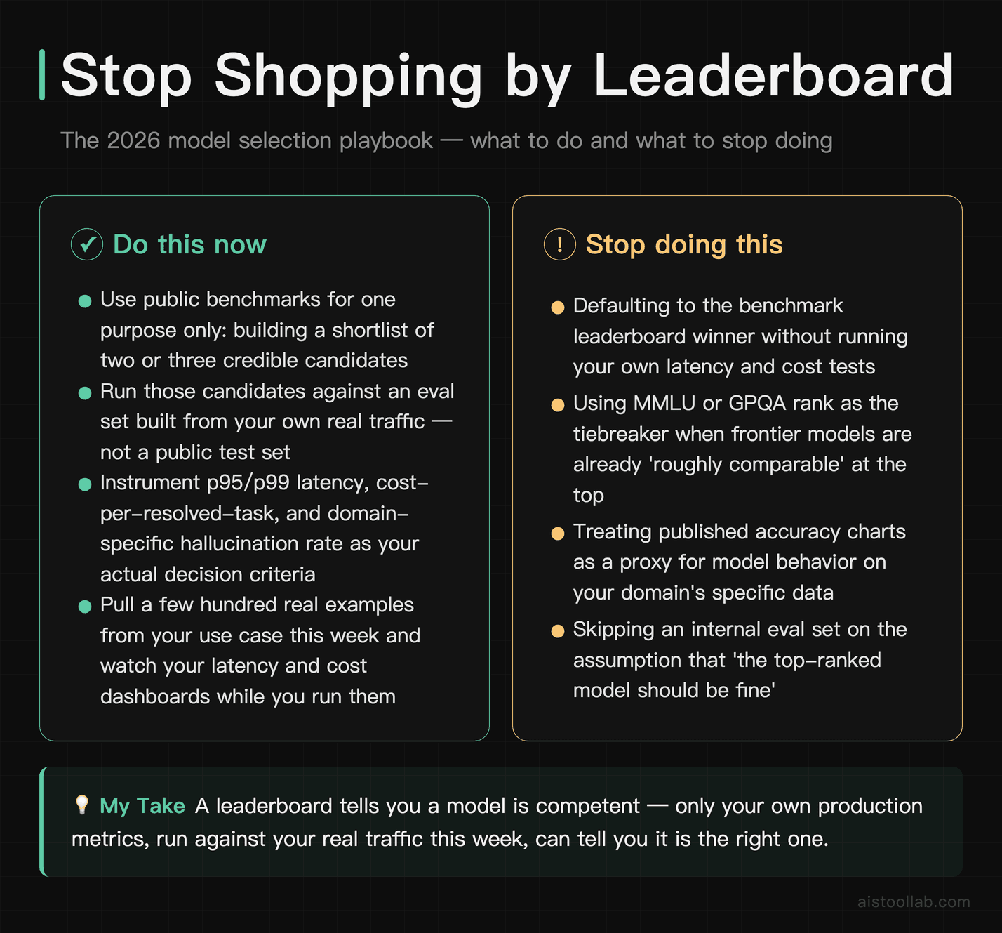
If it were my budget and my product on the line, here’s exactly how I’d approach model selection in 2026. I’d use public benchmarks for one thing only — building a shortlist of two or three credible candidates. Then I’d ignore the leaderboard entirely and run those candidates against an evaluation set built from my own real traffic, while instrumenting p95/p99 latency, cost-per-resolved-task, and domain-specific hallucination rate. The model that wins on those numbers gets the job, regardless of where it sits on MMLU.
The frontier models from Anthropic, OpenAI, and Google are all genuinely excellent, and for most teams the benchmark differences between them are noise. The real decision lives in the metrics that never make it into a press release: how fast, how cheap, how consistent, and how reliable on your data. A leaderboard can tell you a model is competent. Only your own production metrics can tell you it’s the right one.
So here’s your next step — don’t take my word or any leaderboard’s. Pull a few hundred real examples from your own use case, run your top two candidates against them this week, and watch your latency and cost dashboards while you do it. You’ll learn more about which model actually fits your product in those few days than from every benchmark chart published this year. For the broader context on how to read those charts responsibly, the Open LLM Leaderboard Review 2026 is a good companion read.
Last updated: 2026
Found this review helpful?
Subscribe to aistoollab.com for weekly AI tool reviews, tutorials, and comparisons — straight to your inbox.
👉 Browse the AI Tools Library to find the right tools for your workflow.